
"Shower Thoughts" Gig Poster

The Task at Hand
Shower thoughts is a progressive/psychedelic rock band, inspired by influences such as Pink Floyd's "Dark Side of the Moon", King Crimson's, "In the Court of the Crimson King" and The Jimi Hendrix Experience's "Electric Ladyland". The task was to make a gig poster for this band playing in the city of Denver Colorado. Broadly speaking, the task of the poster is to transfer the idea of this style of music. The idea of breaking out of the norm, the mundane and the possible, and burst into the realm of the strange, the abstract and the impossible, that progressive and psychedelic rock is known for, while still carrying heavier overtones.
Initial Drafts
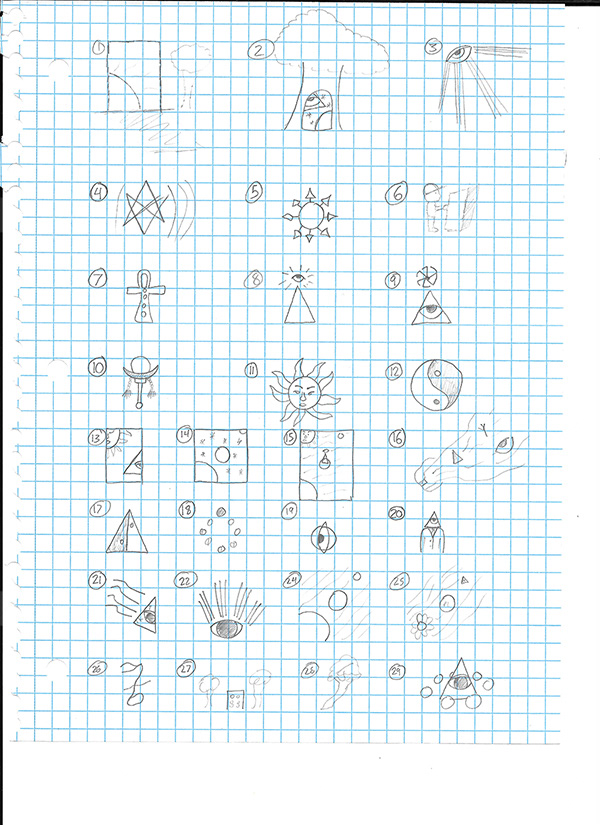
My first process was to get my ideas down on paper, and find something to work with. I knew from early on I wanted to work with a space scene, but somewhere out of our own solar system, to help with the feeling of "weightlessness" that this genre of music strives to produce. But I also wanted to work with symbols common in the genre, such as the sun god and the eye of providence. To that extent I set to sketching different space pieces, as well as imagery with deeper symbolism.
Digital Sketching
After sorting out my sketches, and knowing exactly where I wanted to go with I started working with digital sketching. At this point I decided I wanted to do a mountain forest scene with a portal in the center of the poster, transporting the user to the abstract realm the music meant to portray.

My first round of drafting produced the image shown above. The font did not feel right, it felt out of place, and like it didn't belong on the poster. The stars felt too rigid, like there should be some fade into them in the lighter blue area. So those were the two things I set to fixing next.
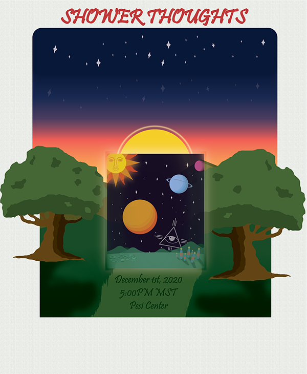
From there I produced the image above. But it still felt full of problems, so I went and showed it to some colleagues and friends to get some other opinions on the poster. To my disappointment, it felt like a lot of people just did not get the idea of the poster at all. Furthermore, there were all sorts of problems brought up having to do with the sunset, the trees, shadows and the grass. But to me, the biggest problem was that people did not understand the imagery.
A New Direction
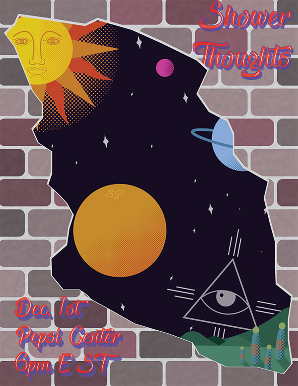
After the critique I received from friends and colleagues I decided I needed to take my idea in a different direction. I still wanted to keep the idea of breaking through the norm, and into an abstract space scene. So I started brainstorm different ideas on how to portray to the viewer that transportation between the real world and the abstract one felt by the music. The idea then came to me that seems obvious in hindsight. Posters are intended to be hung on walls for people passing by to see, what if I had the foreground a wall, and then a chunk ripped out of it, in which, the viewer could see through the tear into the abstract space scene. At this point I decided to throw out the mountain forest scene and take the poster in that direction.

This was the original idea for the brick wall ripped out that I went with. Instantly I liked it a ton better than the mountain forest scene. There were still small things about it that I did not like, but we're getting closer.
The Final Poster
This is the final design I came up with. I toned down the bricks to make them less vibrant, making the physical world the viewer was in, less interesting and more dull, while the world they could escape to, would be more full of color and interesting. I also made small alterations, from wrinkles to corner changes to make the bricks each unique, rather than the same brick over and over. I then had my computer generate a black and white perlin noise map, and used an opacity map to overlay the texture on the brick. I did one layer to lighten, and another layer to darken, so that I could get three tones on each brick, outcrops(light), indents(dark) and base level, the normal color. I then also used a graffiti like font, giving it a blend to get that signature graffiti vibe and adding the white lines as highlights, seen as common in a lot of graffiti. I then gave it the same texture as the bricks to help it fit better with the background. This also allowed me to give it a faded look, like graffiti that had been there for a while, rather than being a fresh paint. This helps keep the mundane feel on the physical world I was going for, allowing the abstract to remain the most vibrant thing on the poster.

